The Challenge
Technicians were managing work across too many places.
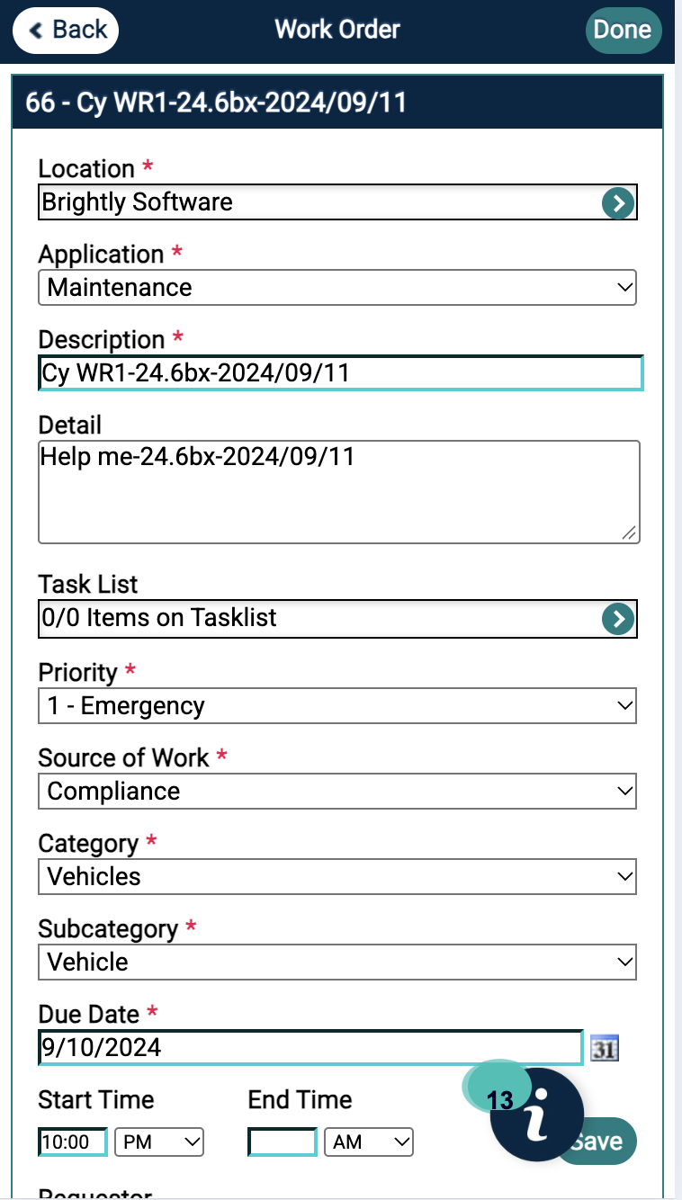
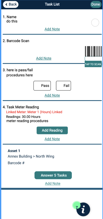
Our technicians were using multiple portals to access and manage their work orders. The existing experience made it difficult to quickly answer basic questions:
What work do I need to complete?
Which jobs are scheduled for today?
What needs my attention right now?
How much time have I spent on a job?
How do I update the status while I'm in the field?
The challenge wasn't simply making the interface look better. We needed to understand how technicians actually worked and design around the decisions they needed to make in the field.
My Role
I was the lead UX designer responsible for:
Research → Synthesis → Information Architecture → Interaction Design → Prototyping → Final UI
I partnered with internal stakeholders, product, and engineering while conducting research with 7 external clients and using behavioral data from Pendo to identify pain points in the existing experience.
Competitive Analysis
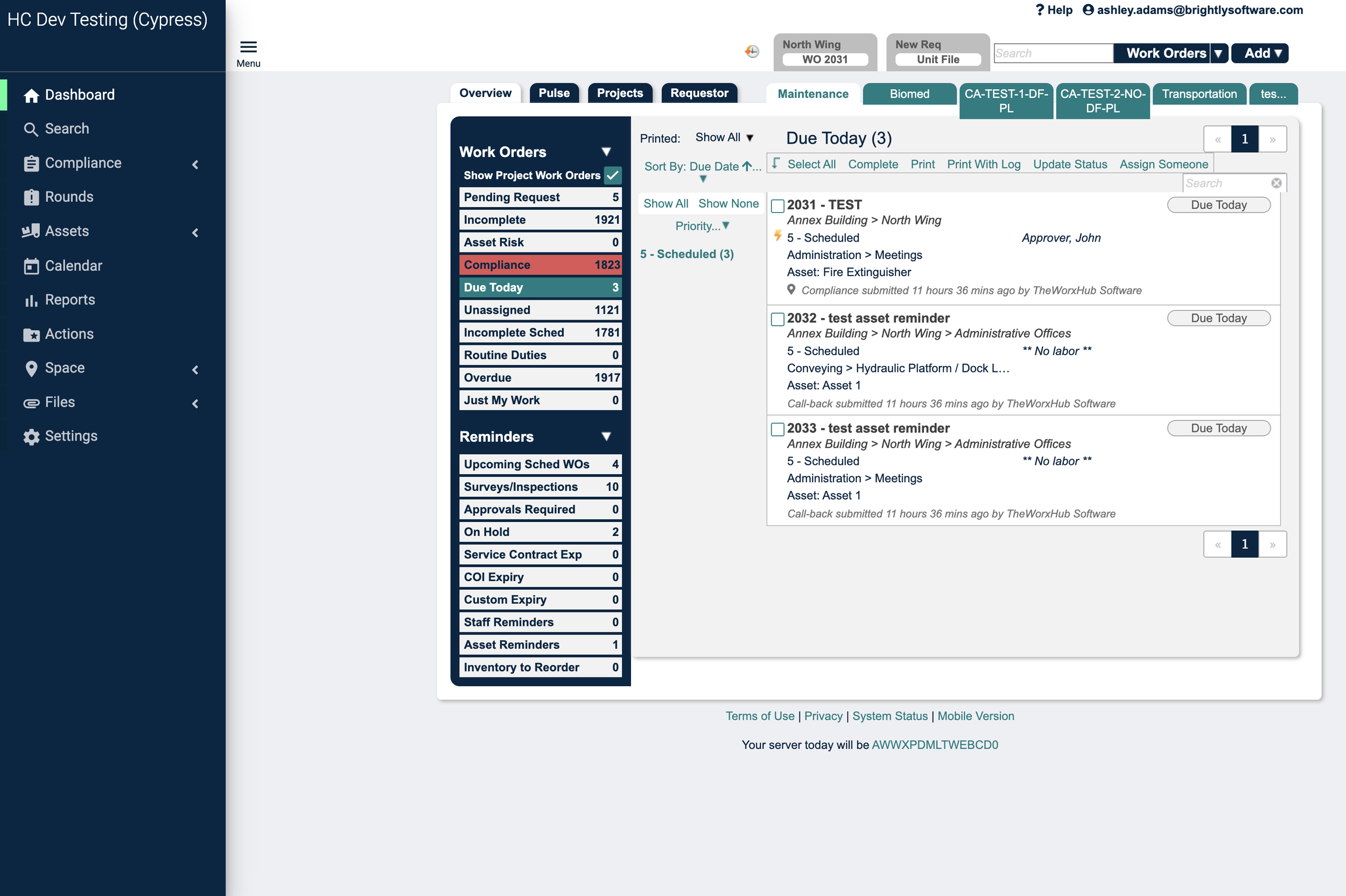
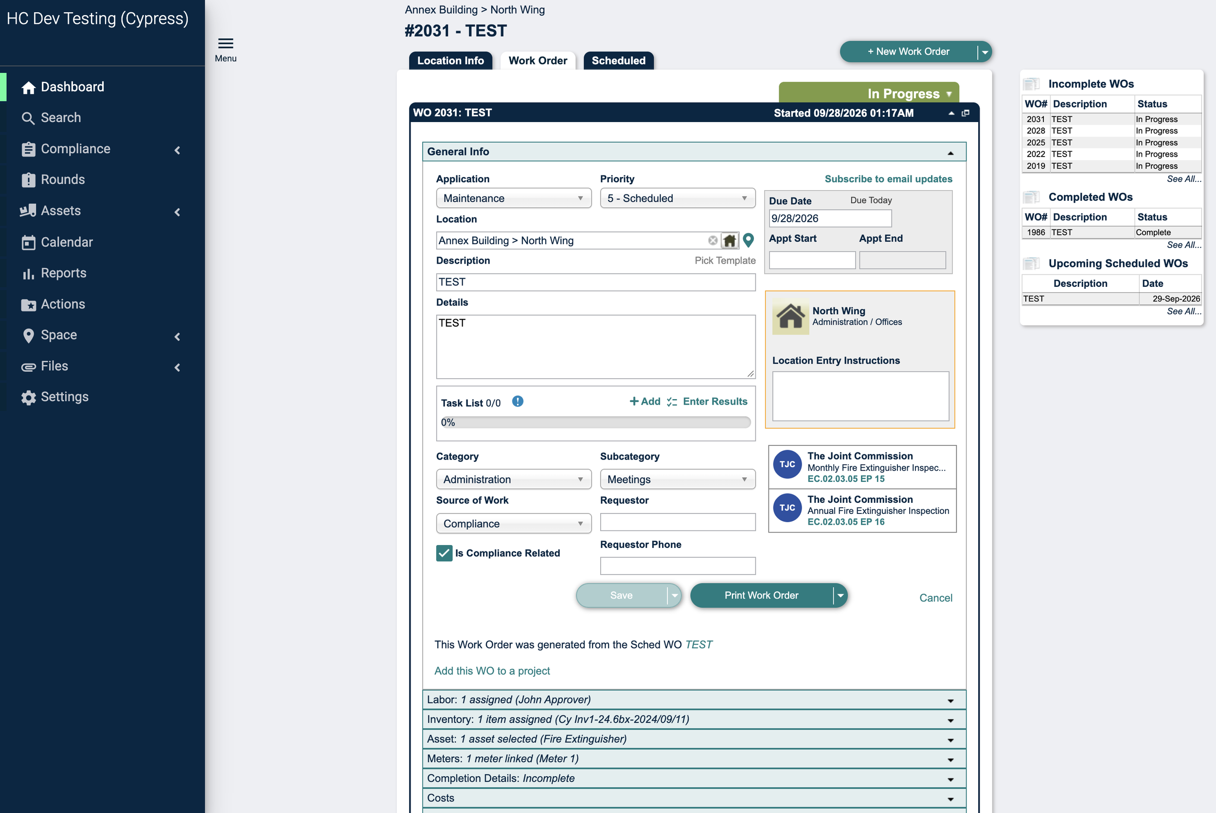
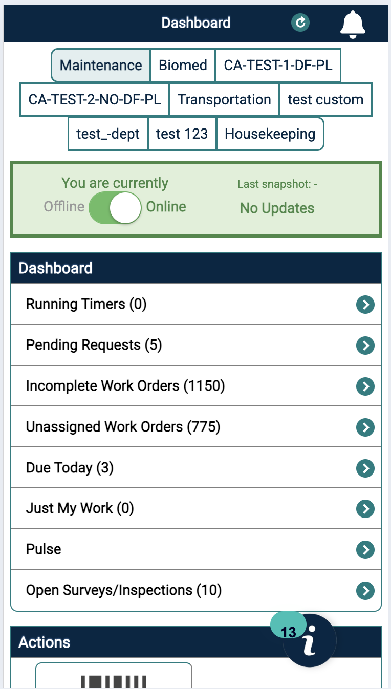
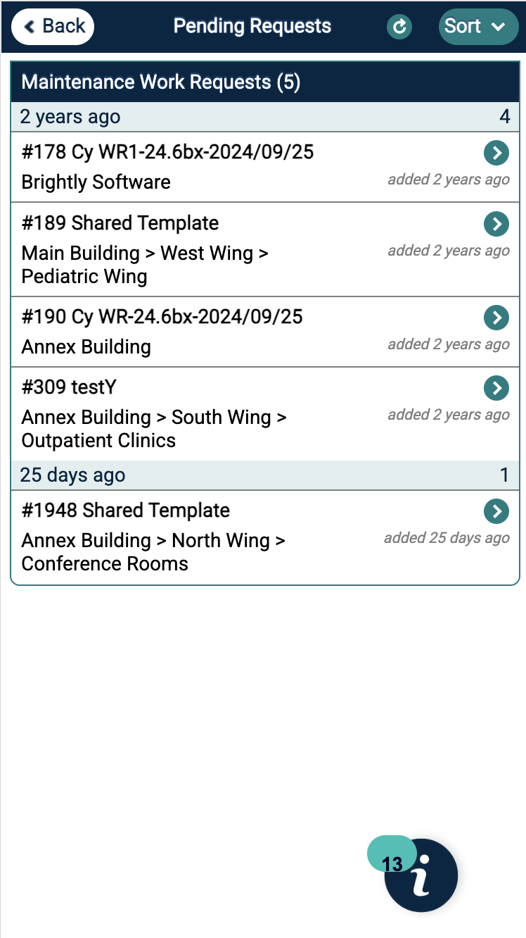
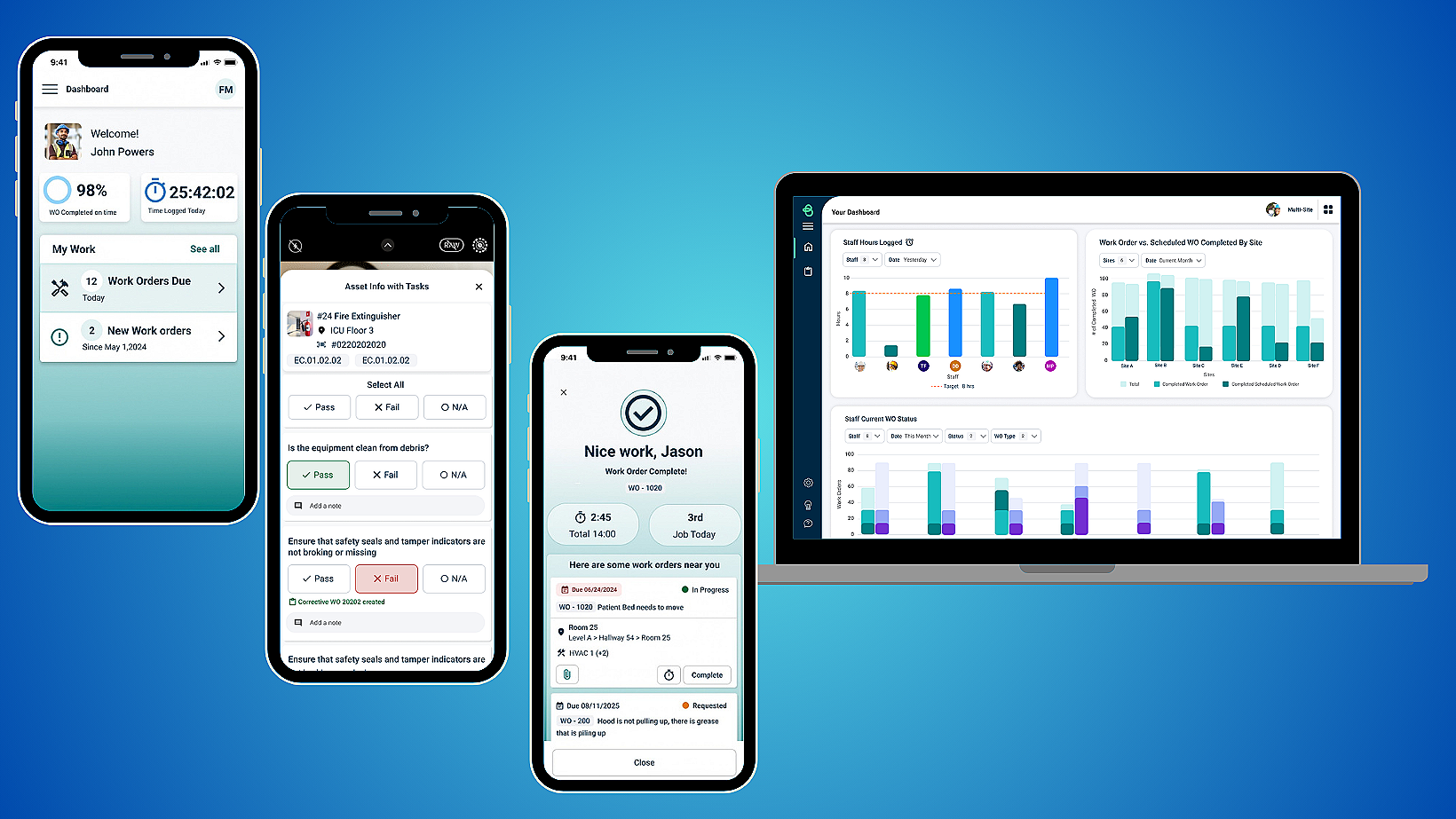
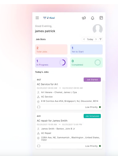
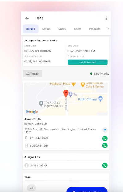
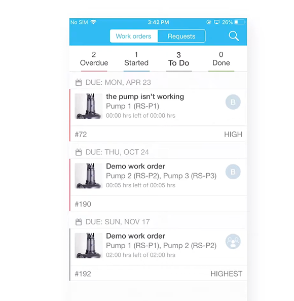
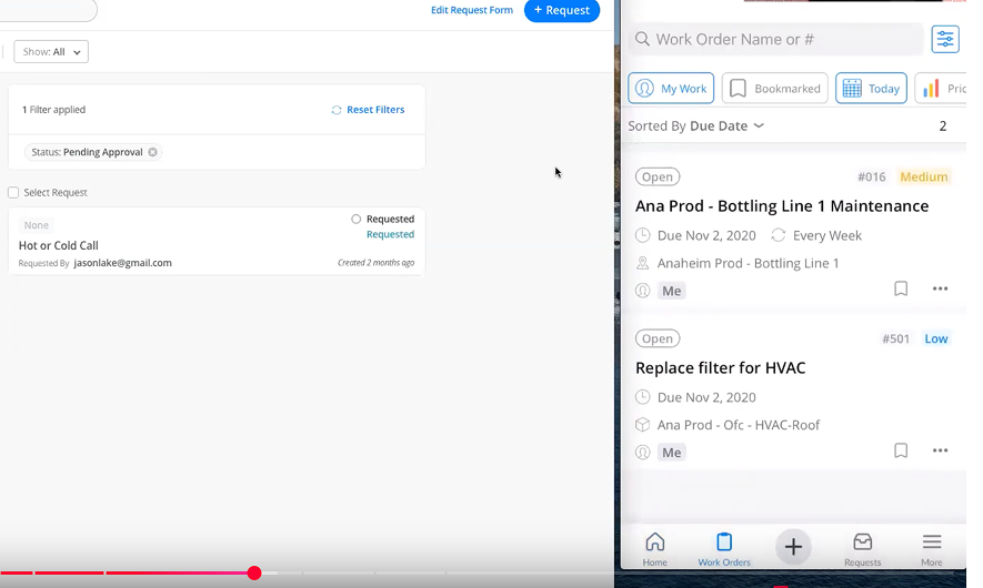
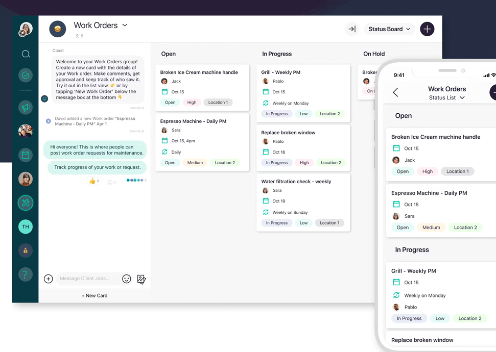
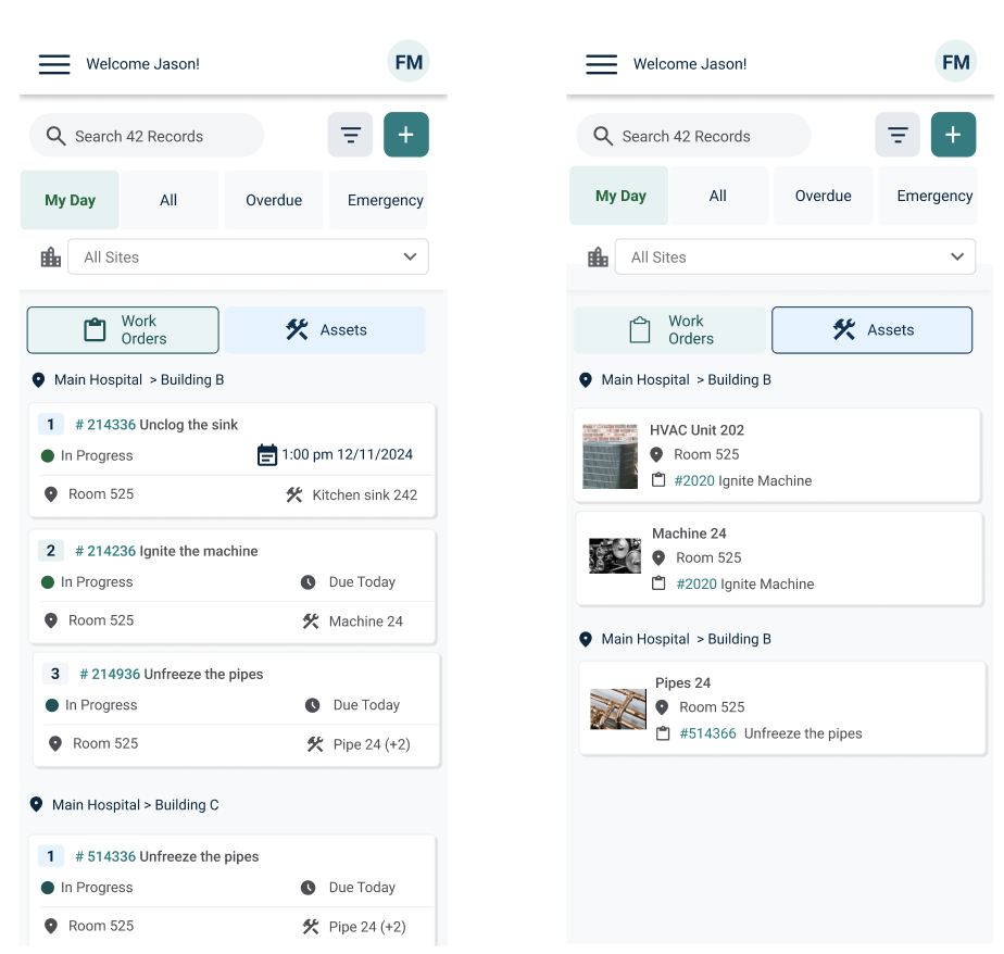
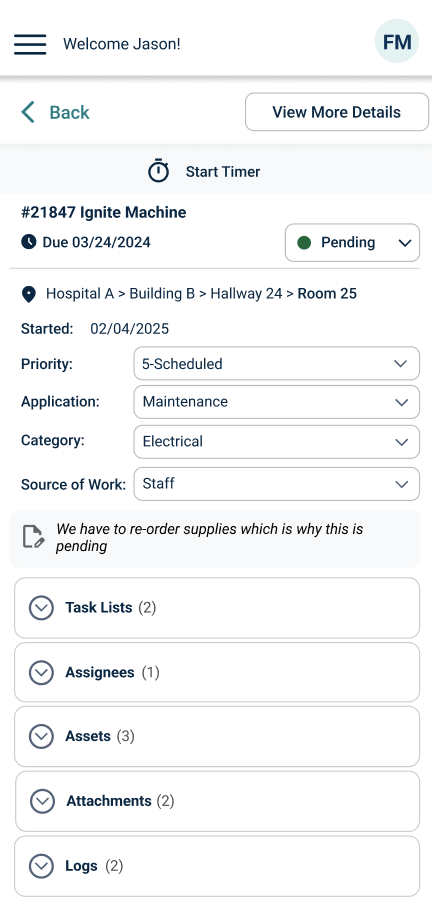
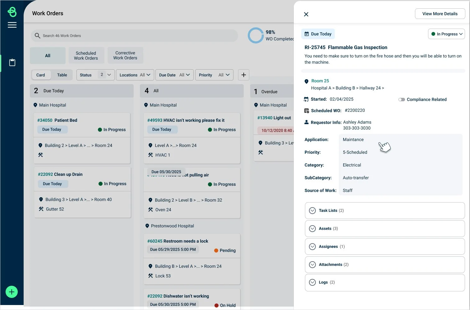
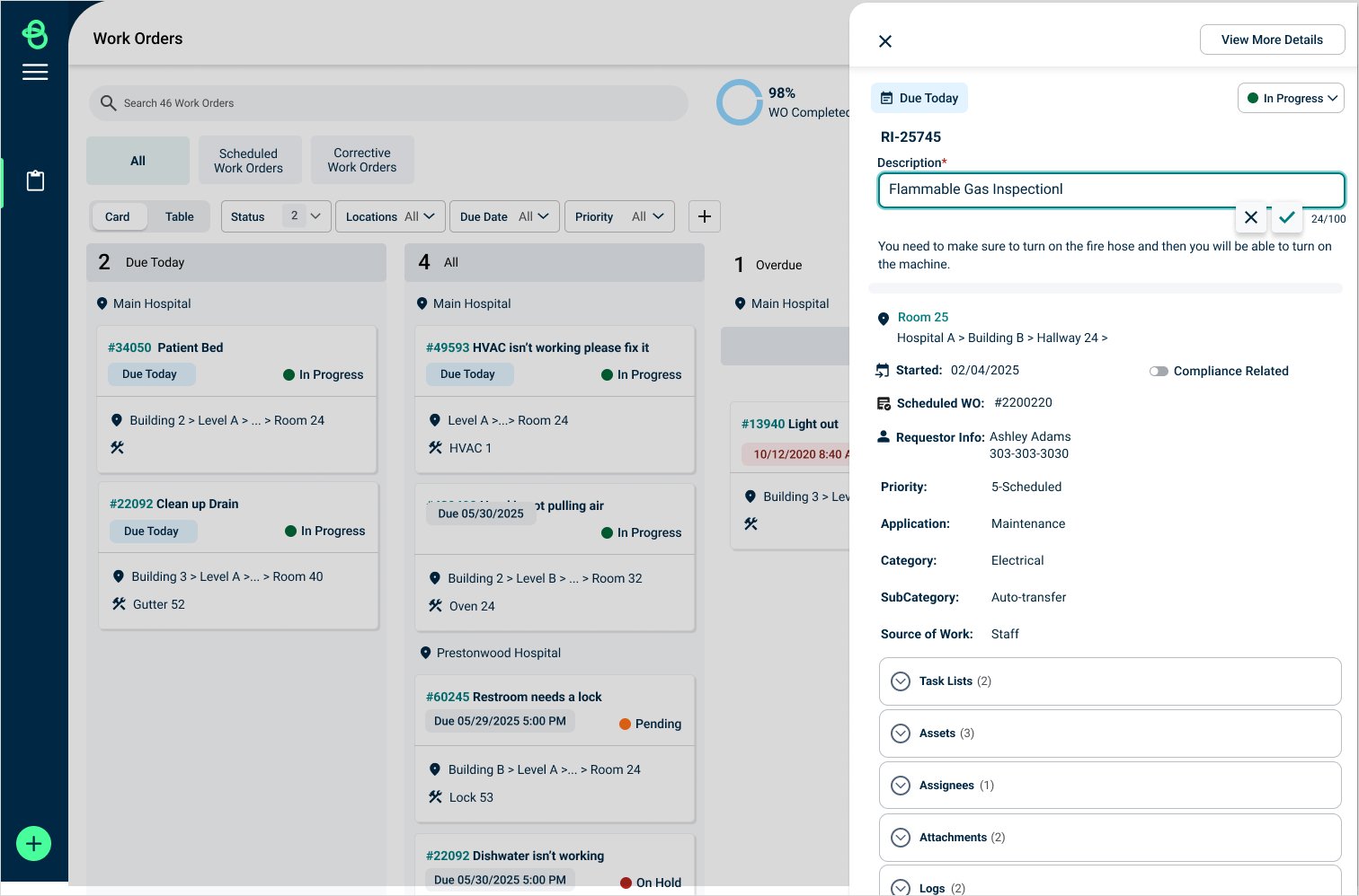
This UI refresh is designed to make the experience effortless for technicians, who often aren’t heavy tech users, by enlarging buttons for better accessibility, simplifying access to work orders, and enabling seamless tracking of timing and completion. We've also introduced “quick tabs” to clearly separate sections, along with a slide‑out panel for rapid access and streamlined navigation.

Understanding the Technician
I started with the people doing the work—not the existing interface.
I conducted interviews with internal stakeholders and 7 external clients to understand how technicians actually interacted with work orders.
I also reviewed Pendo usage data to identify areas of friction in the existing workflow. With this qualitative data I was able to make mid-fidelity prototypes.
Research questions
I wanted to understand:
How do technicians prioritize their work?
What information do they need before starting a job?
What actions do they perform most frequently?
When do they use mobile vs. web?
What causes technicians to leave the current workflow?
Which information needs to be immediately visible?


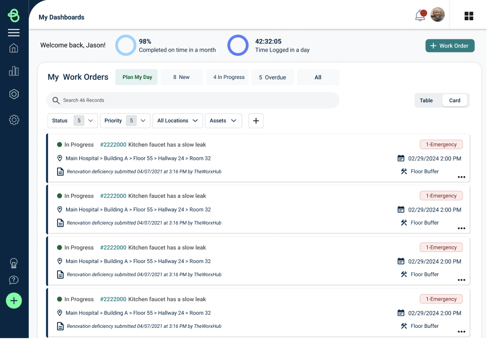
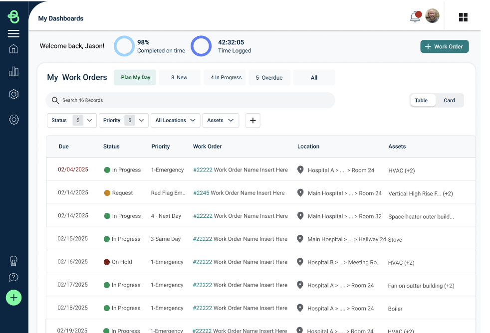
Interview Breakdown
Research finding
Scheduled work needs to stand out
Technicians work in the field
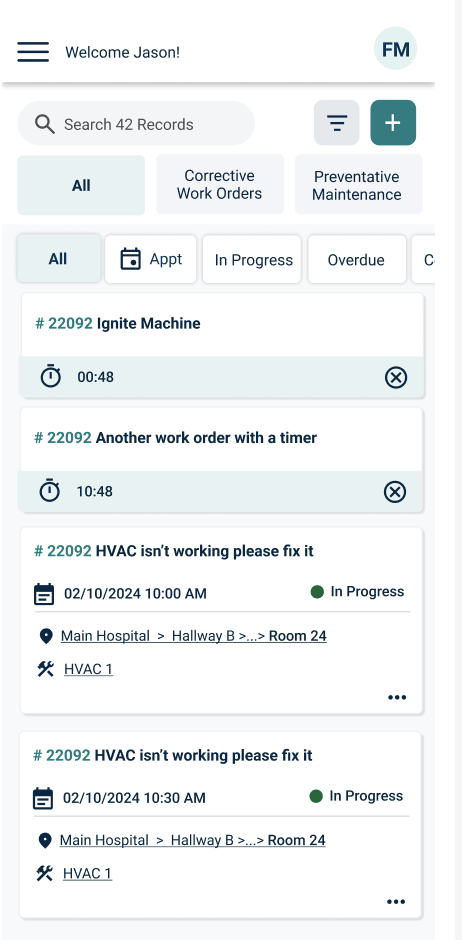
Timers are easy to miss
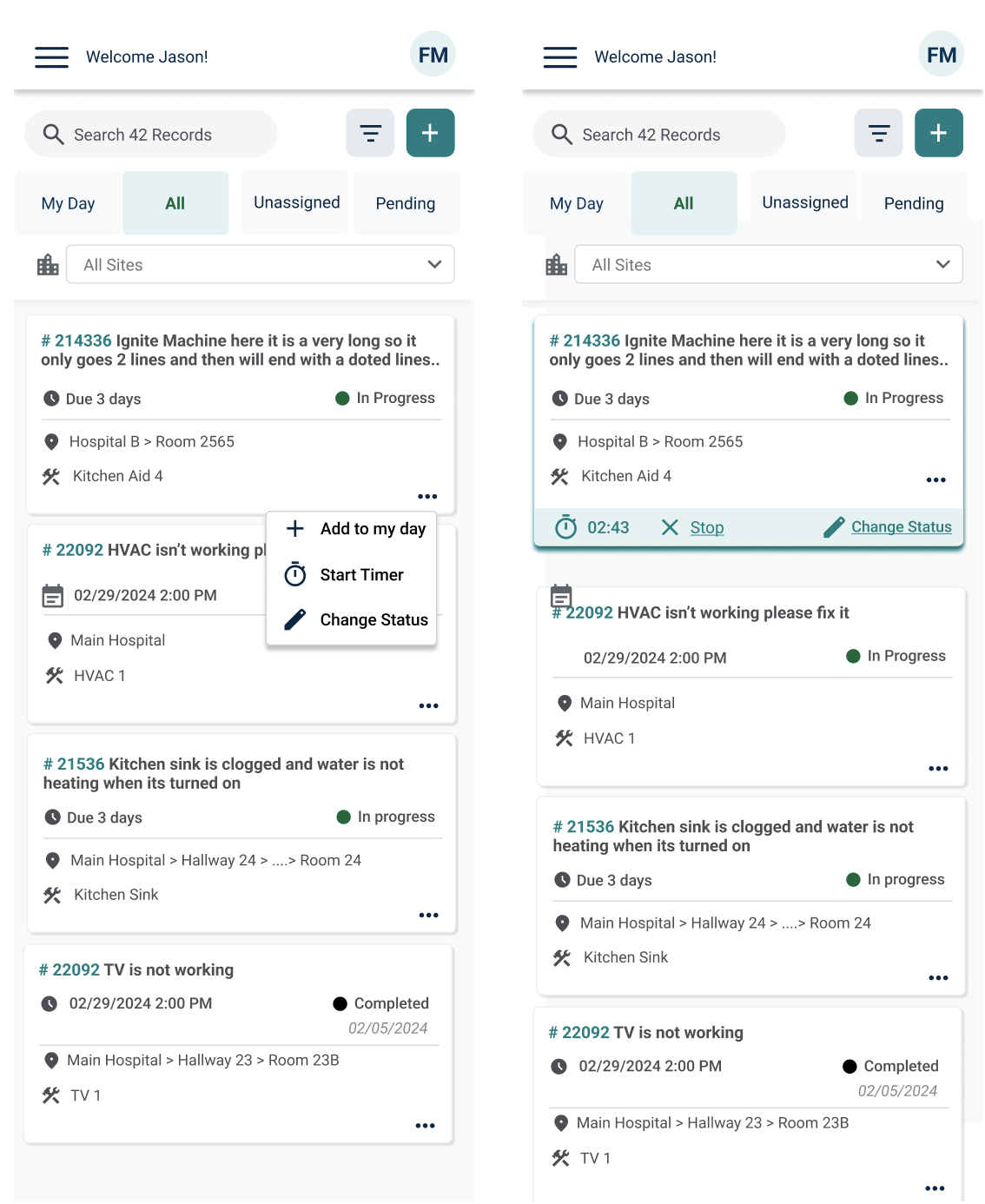
Frequent actions should be fast.
Technicians aren't necessarily heavy technology users
Lead technicians use desktop
Design requirement
Separate scheduled and regular work
Mobile-first experience
Surface timer information
Reduce navigation
Larger touch targets + simplified UI
Maintain a complementary web workflow


What I Heard
The research quickly revealed that "all work orders in one place" wasn't enough.
Across interviews, several patterns emerged.
01 — Scheduled work needed to be distinct
Technicians needed to quickly distinguish scheduled work orders from their other work orders.
This wasn't just a visual preference—it affected how quickly they could decide what to work on next.
"Scheduled vs. regular work orders need to be separated."
This came up consistently across interviews.
02 — The experience needed to work in the field
The technicians weren't sitting at a desk.
They were moving between locations, working on equipment, and using the product while actively completing jobs.
That meant the interface needed to prioritize:
Visibility → Speed → Large touch targets → Minimal navigation
Mobile wasn't an optional version of the experience. It needed to be central to the workflow.
03 — Timers were easy to lose
Technicians needed visibility into the timers associated with their work orders, but that information wasn't accessible enough in the existing experience.
Rather than making technicians dig into a work order, I explored ways to make timing information available directly from the primary workflow.
04 — Web still mattered
Although mobile was critical for technicians in the field, research also revealed an important secondary user: lead technicians.
Lead technicians sometimes needed to use the web experience to update statuses and manage work.
This led to an important design principle:
Design around the job—not around a single device.
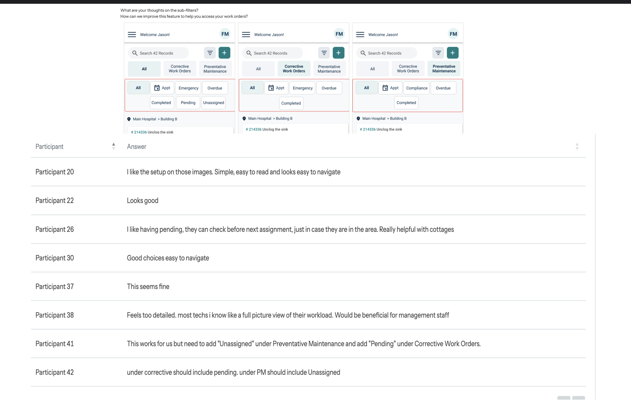
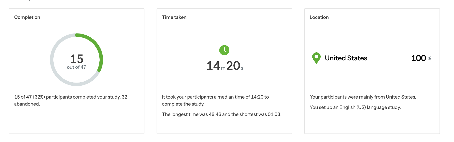
Survey Mode
After designing the prototype, I wanted to make sure I wasn't just solving the problems I thought users had.
The client interviews gave me a strong understanding of the existing experience, but I wanted to validate whether the proposed solution actually addressed those needs.
I created a survey that showed users the final prototype and asked targeted questions about the proposed workflow, navigation, and key features.
What I was looking to validate
Could users quickly understand how to navigate their work orders?
Was the distinction between different types of work clear?
Were the most important actions easy to find?
Did the proposed mobile experience support technicians working in the field?
Did the new experience address the pain points uncovered during interviews?
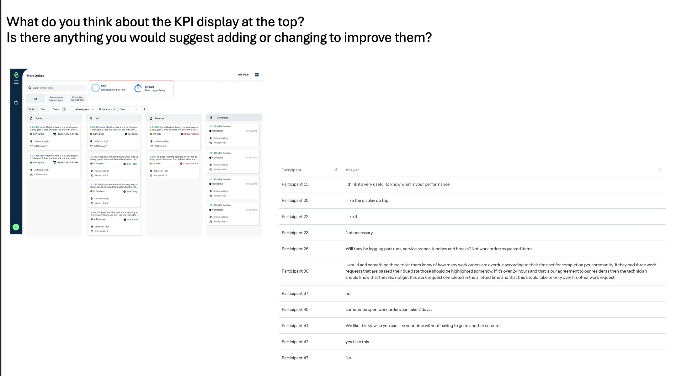
01 — Keep the experience compact without sacrificing usability
Users needed to see a lot of information at once, but the interface couldn't become overwhelming.
I refined the layout to keep information compact while making the most important actions and details easy to scan and access.
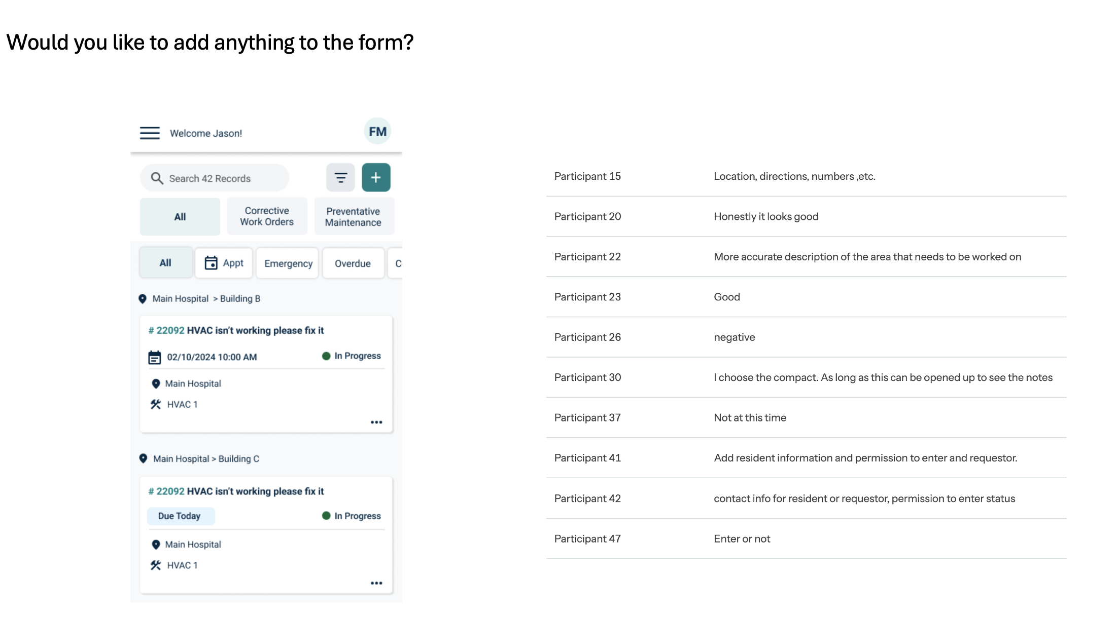
02 — Give users the information they need upfront
The prototype initially didn't surface enough context around a work order.
Based on user feedback, I added information such as requestor details so technicians could better understand the work they were being asked to complete without having to navigate elsewhere.
03 — Unassigned work was more important than pending requests
One of the most valuable findings was that our initial assumptions about work-order status didn't completely match what users needed.
We had been considering Pending and Unassigned as two important states. Through validation, we found that users placed more importance on identifying unassigned work.
That changed the way I prioritized information in the interface.
The research didn't just validate the design—it changed it.
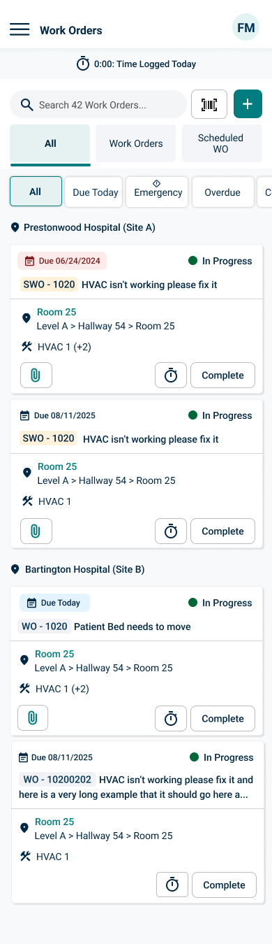
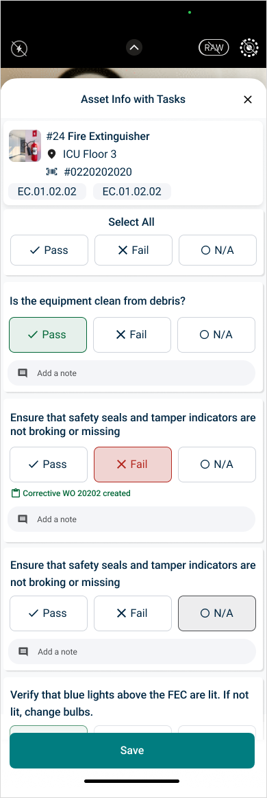
Final Designs
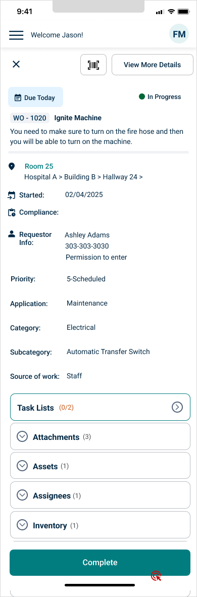
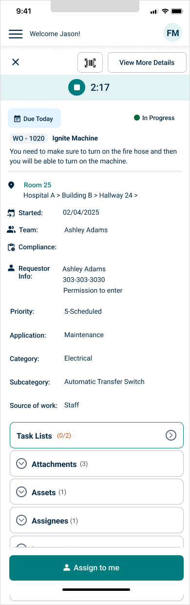
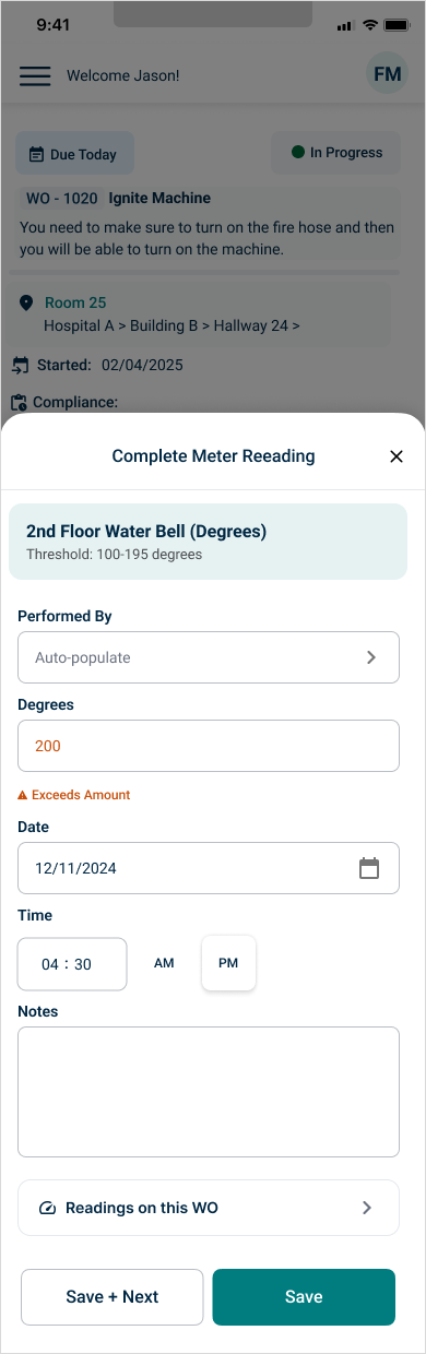
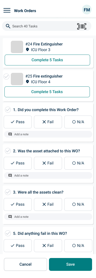
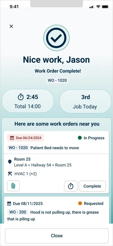
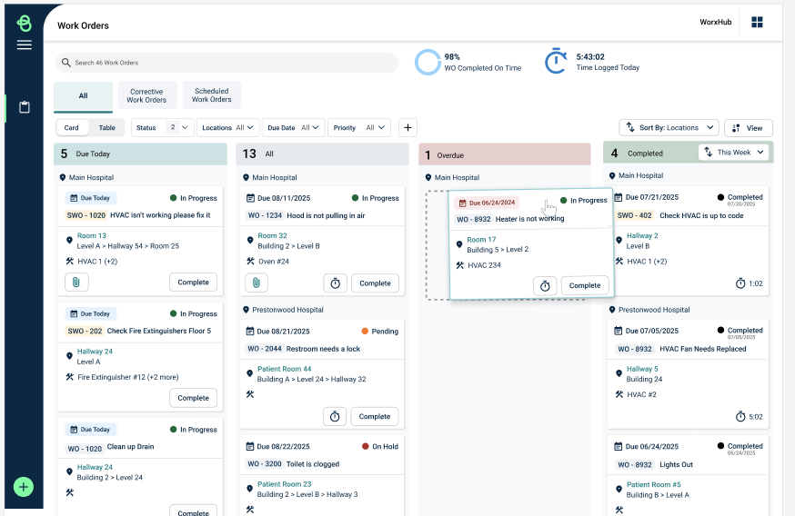
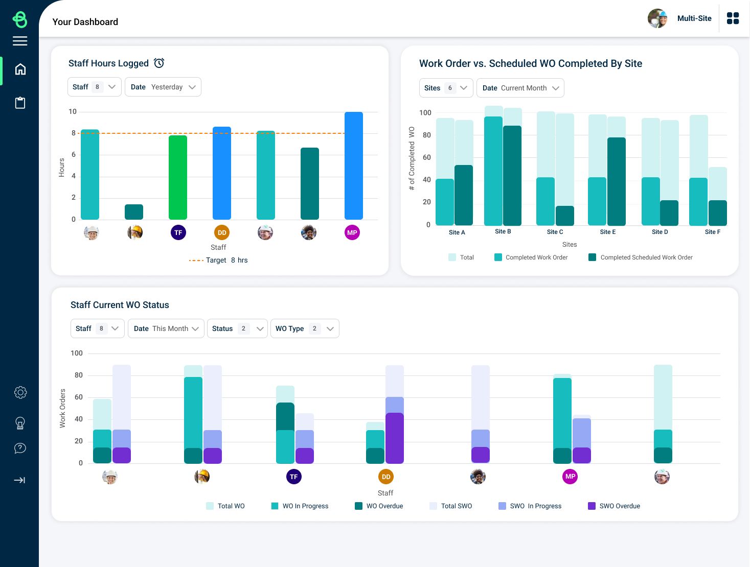
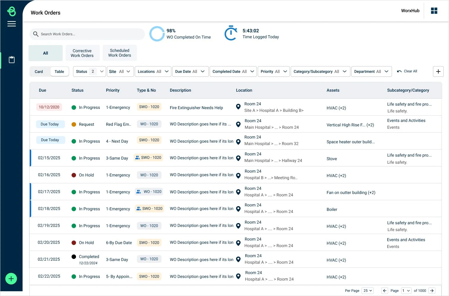
The research gave us confidence to prioritize:
Mobile-first workflows
Clear separation of scheduled vs. regular work
Faster access to work orders
More visible timers
Larger, more accessible controls
Complementary mobile and web experiences
What I would’ve explored next
Designing for the next layer of field-service efficiency
There were several opportunities that we identified but didn't pursue because of technical complexity and project scope.
Location-aware work
Because technicians travel between sites, integrating location data could help them understand where they need to go next and potentially provide directions.
AI-assisted work-order discovery
AI could potentially help technicians quickly find the right work order or surface the most relevant job based on their current context.
Smarter prioritization
A future experience could use job status, location, urgency, and scheduling information to help technicians determine what work needs attention next.
These ideas weren't included in the final release because of the engineering effort required, but they represent opportunities I would explore through additional research rather than assuming technology alone would solve the problem
Previous Mobile and Web